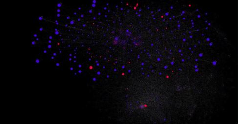
[Each of the “dots” in the graphs above – there are about 100.000 of them – even the tiniest small ones barely visible at this level of zoom, represents a twitter user (blue dot), or a hashtag (red dot). The size indicates the importance, influence, of that node within the network.]
In these times of mass surveillance, where NSA, GCHQ, FRA and their pals suck in as much data about as many people they can, i.e. everybody and everybody’s communications, I thought it might be interesting to do something similar.
Of course, I neither have access to all the interesting sources that the NSA gang can tap, such as email, phone calls, search histories, web histories etc of my “targets”, nor do I have the processing power to deal with zillions of data points, but, nevertheless, there’s some very interesting, and occationally chocking, insights to be gleaned even in small scale, poor man’s mass surveillance of open sources… In my case, from Twitter.
Over the past few days, I’ve collected and analyzed about half a million tweets from a very diverse set of people.
The initial set was the people I follow, they are about 200 in total. Not many surprises there, in terms of “chocking” discoveries…
For each such “target” from my original list, I analyzed their 200 latest tweets for mentions of other twitter users and any hashtags, which became “nodes” in my graph.
For any such “new” target, i.e a mention, obtained by analyzing my original list of followers, I added that mention to the list of targets to be analyzed.
Therefore, the set of targets to be analyzed grows exponentially: from my original 200 targets, after 3 iterations I’ve got more than 100.000 nodes in my graph. If I would have even a fraction of the computing resources of the professional mass surveillance guys, I could expand my traversal of the twitter network to even further levels, but with my limited computing resources – a standard laptop – I will stop here, this amount of data starts to be too much for my laptop to handle already.
The images above show the high level view of the obtained social network graph. At this level, it’s impossible to make much sense of the data, but using an interactive tool like Gephi, it’s very easy to make such an analysis.
And there are interesting pieces of information to be gained from such an analysis, e.g. who would have thought that one of Sweden’s most well known politicians is connected, over three links, to a very famous porn-star….`?!
Three links is apparently what the professional mass surveillance folks of NSA et al follow for any target they are interested in, and as the example with the politician above shows, with three links you will find dirt about anybody and everybody, in our extremely interconnected world.
As the “Six Degrees of Separation” theorem states, every person on the planet is connected to everybody else by a maximum of 6 links, thus, already at 3 links you will be connected to millions of people that you have no idea of who they are nor what they do, have done, or plan to do.
In other words, it’s extremely unlikely that those at 3 degrees separation from you have anything what so ever to do with you, or you with them, but still, the government spooks are eagerly collecting as much as they can, relevant or not… And they store this data for eternity, for “future purposes”.
Some facts about my poor mans mass surveillance:
– 500.000 tweets analyzed
– 100.000 nodes (users/tags) identified
– 200.000 links (relationships) identified
– I used Python for the data collection and formatting, Gephi for display
– I used a 8Gb 4 core laptop for the collection and analysis


